Showing posts with label product naming. Show all posts

How to Name an Innovation (the movie)


Design legend, Don Norman, honored me with an invitation to speak at UC San Diego Design Lab about naming innovations. My talk specifically focused on innovative product descriptors, the part of a name that establishes what the product’s category is, such as “smartphone” or “universal remote”.

Why is a product descriptor important? If you're inventing a “World’s First” product, the invention’s product descriptor should establish a category all its own. But naming a unique product category is not always easy.

In my presentation, “Naming the New”, I detail a best-practice process to develop an innovation’s product descriptor. Real-world project examples for Quell and Cinder illustrate how it works. The video is an hour long, but you'll probably learn a lot if you get through the whole thing.       

If the topic of novel product descriptors interests you — and how could it not?! — read my other posts on the topic, Describe Different and The Names of MIT Media Lab

Enjoy!


Fifty Futures


It’s my job to imagine different tomorrows.

As a professional namer, I strive to explore every perspective on my clients’ new brands. Each one is articulated as a name, representing a potential brand future. After spending weeks creating names and then filtering them through trademark screening, I present a shortlist to my client. Many possibilities, all potential, but which one will become reality?

Like Schrodinger’s cat, who, while boxed up is dead and alive at the same time, these names are futures coexisting under the cloaked secrecy of a client presentation. Once the curtain is lifted and the final, approved name is launched worldwide, those possible futures, the ones that might have been, evaporate (my clients get to own one name I have developed, and the rest go back into my quiver). All that remains of the runners-up is a memory, lingering among the select group in attendance at the original presentation, and they are all sworn to secrecy.

But this once, my client and I have agreed to share with you a few of the futures which a list of names represents. Although the final chosen name for this assignment is a particular favorite in my portfolio, the runners-up reveal a lot about how a namer thinks, and how the process of naming works.

The Project

In the spring of 2012, I was approached to name a start-up. My client was creating a line of ready-to-drink cocktails, made with select, natural ingredients, organic when possible. The drinks would be lightly carbonated, delicious and, being made simply, would be low in calories. These cocktails, starting with a margarita, would give competitors like Skinny Girl a run for their money.

My client didn’t have much capital to invest initially, so I agreed to be compensated, in part, with a thin sliver of their revenue for a few years. If they didn’t succeed, at least I could experience the sheer fun of naming a new line of cocktails.

The recipes were created by three women who called their stealth, startup venture Moms on the Rocks, a witty name befitting their bubbly personalities. With a placeholder that good, I knew this client would be a great partner in naming.

Names are a mirror. They reflect products and the people who create them. After all, it’s the founders who ultimately set the direction for naming, narrow the shortlist of potential candidates and anoint the finalist. You can learn a lot about the founders of a company just by looking at their placeholder name. 

Fun, confident, outgoing, opinionated, unvarnished. In my briefing with the founders, these emerged as the traits that best described them and the personality of their new brand. Each of these qualities was a starting point, and from there, I searched for related words, branching out in ever widening circles. Exploring outward in every direction from these core ideas traces a sphere in words. These words form a world, and every point on and inside that world is a possible future.

For this project, I explored several concepts, included fresh, natural, green, fruit, squeeze, mixing, farm, agriculture, organic, and pure. I also looked at idioms and phrasal verbs to see what might pop up. 

After two weeks of exploration, I cherry-picked the best names and screened them for trademark availability. How? That’s a topic for another post. 

So what are the futures, the names, that might have been for this line of cocktails? Here are a handful:

Happy Place –Where does a great drink take you? For some, it’s here. The name Happy Place would tell the clients’ story about their Marin County home, the orchards where fresh limes are picked, and the Mexican fields where the blue agave grows. If this were the name, the brand would be about places that make people happy. The client could sponsor a YouTube channel where people tell their stories about places that are dear to them and make them smile. 

True Nature – The cocktail’s natural ingredients were fertile territory for name exploration. This one would emphasize the cocktail’s use of real fruit juices. True Nature would be an honest brand, a straight shooter. But it’s not terribly fun, while my clients and their brand certainly are. It's a good name, but for a different product.

Green Party – Natural doesn’t have to be serious. With a name like Green Party, this brand could be about having a great time naturally. Sure, the name skews political, but what if it were paired with a picture of dancing limes? With the right imagery, this would move the name away from Ralph Nader and towards skinny dipping and icy glasses of margaritas. Party on!

Picnic – You can feel the sunshine in this name. It’s warm, fresh and innocent. There’s a light buoyancy. The name is all about being social, with friends and family. A margarita called Picnic would be full of fresh fruit. The label might sport red gingham. It would be simple and honest. It would be good and clean and fun. Picnic illustrates how a surprising name can also be a real and common English word and not some crazy coinage. 

Squoze – A playful way of suggesting fresh-squeezed. Squoze would be a brand about living life with a twist,  and sometimes being a bit twisted. Familiar objects and experiences would be featured, but they’d be a bit off, in a safe and playful way: 
We hug our limes until the juice comes out. That’s Squoze. 
Be the lime of the party. Bring Squoze. 
Something to that effect.

Laughing Glass – This is not a name that might have been. This is the name. Because it articulates the sheer delight the client sought for their brand foundation, Laughing Glass was adopted as the go-to-market moniker. When a name instantly has the whole room beaming, as this one did for the client, it stands a great chance of success in the meeting and the marketplace. The name inspired the brand philosophy, Laughing My Glass Off and reflects what the client really believes in: Joy.

Snappy packaging by Voicebox Creative

The founders, in high spirits in The San Francisco Chronicle 

Laughing Glass is the reality that we see today on shelves in Whole Foods and elsewhere throughout California. But it didn’t have to be that way. It could have been one of the other names I presented to the client that day. Each one would have emphasized different aspects of their identity, and raised different expectations in their audiences.

I’m very grateful to Laughing Glass for such an exciting collaboration, and for letting me share this peek behind the curtain.

Thanks to my go-to copywriter Daniel Meyerowitz for valuable edits and contributions. 

Pause: A Brand For Our Time

One afternoon, an entrepreneur named Ben Tabai called me. He liked my blog, and wanted to know if I was interested in helping him name a new relaxation beverage. The opportunity was so unusual, so exciting, that just developing the name didn’t feel like it would be enough. I proposed that Operative Words also develop the tagline and provide creative direction on the brand identity and packaging. Our mutual enthusiasm sealed the deal.

This project began, as all do, with learning about the product category. I discovered that the emergence of relaxation beverages bears significance. More than just new products on the shelf, relaxation beverages are an inevitable outcome of our times.

Let’s consider their larger context. Advances in technology enable people to be constantly connected. Social networks and societal expectations urge an immediate response to every email, tweet and text message that comes our way. As a result, we have become overloaded and under-rested. It’s no wonder that relaxation beverage sales doubled between 2008 and 2010, and is projected to double again by 2014. Our growing need to unplug is reflected in articles, springing up everywhere.

The names of current relaxation beverages reflect the opposite of our connected world. More analog than digital, the names have a vacation/zen/escape vibe. There’s surprisingly little differentiation:
Dr. Zen’s Liquid Calm
RelaxZen
Serenity Zen
Ichill
Minichill
ViB (vacation in a bottle)
Tranquila
Mellow
R&R
The problem with these names is they are removed from workaday reality of today’s connected urbanites who have the greatest need to disconnect. They don’t reflect the hectic and demanding lives that characterize BlackBerry-next-to-the-bed workers. Aspirations to take a vacation in a bottle or retreat to zen serenity feel more like wishful thinking and suggest promises that can’t be fulfilled.

People who are overworked and always connected do need relaxation. But relaxation should be framed in a real-world and relevant context, not as a pie-in-the-sky, day-at-the-beach fantasy. Therefore, I recommended this new beverage should make relaxation practical and relevant. It should be inspired by, and be a part of, our digital, connected world.

Allow me to take a short detour and provide instructive details about the creative naming exercise that led to Pause.   

In developing creative directions for a naming project, it’s most fruitful to broaden core functions or benefits to more conceptual, expansive ideas. Creative development for this new brand required thinking about relaxation broadly and its context narrowly. Rather than just focus on relaxation, bigger ideas like change, decreasing, cessation and ideal end states were considered, specifically within contemporary and vernacular domains.
 
The ultimate name came up during a creative ‘excursion’ to the ‘world’ of electronics. An excursion is a brainstorming technique that inspires by analogy. I learned about excursions at Lexicon, where I was trained in Synectics problem solving by John Prince, whose father, George Prince, invented Synectics. Excursions are part of the Synectics process and an indispensable part of my creative process. Excursions are related to the ‘cloaked brief’ technique which I described in Creative Names the Easy Way.

Here’s how to use excursions to create brand names: Choose a key attribute or idea that’s essential to the new brand (in this case, change). Then, choose a ‘world’ that’s distant from the actual product category (for example, electronics). From there, brainstorm examples of the key word in that world. For example, change in the world of electronics would lead us to names like Toggle, Switch, and...Pause.

Electronics is an excursion world I came up with, even though there are many already in the Synectics roster. Here’s a list of other worlds to inspire your creative development:

007
Acoustics
Agriculture
Animals
Archaeology
Architecture
Art
Astronomy
Biology
Bridges
Cartoons
Celebrations
Chemistry
Clothes
Comedy
Computers
Cooking
Cosmetics
Crafts
Crime
Decoration
Dinner Parties
Dwellings
Economics
Education
Electricity
Electronics
Espionage
Exploration
Famous People
Fantasy Sports
Farming
Fashion
Films
Finance
Folk Lore
Games
Gardening
Geology
Health
History
Journalism
Kitchen Implements
Law
Machines
Magic
Mathematics
Media
Medicine
Metalwork
Minerals
Models
Money
Movies
Music
Myths
Noise
Nursing
Oceans
Parenting
Physics
Plants
Psychology
Racing
Religion
Rocks
Romance
Science
Science Fiction
Sculpture
Shopping
Smells
Space Travel
Textiles
Theater
Transportation
Tribal Customs
Vacations
War
Weather
Woodworking

Through excursions and other idea generation techniques, over 900 potential names were developed for this assignment. A shortlist of several dozen candidates underwent preliminary trademark screening. About 30 names were presented to my client. 

Demonstrating keen judgement, the client zeroed-in on Pause. The name was unexpected yet relevant. Pause could be a philosophy, a mandate, and maybe even a movement. Enthusiasm was had by all. 

After Pause was vetted by the client’s legal counsel, the naming was complete. The next step was to develop a tagline. This proved to be more challenging than naming, perhaps because there were more creative possibilities, directions and objectives.

It was the general direction of time that inspired the best work. Take ownership of your time as a specific tagline direction, reflected the day-to-day demands that can make people feel as if their time is not under their control. A related tagline direction, be present now, is a cornerstone of mindful relaxation and de-stressing regimens, and therefore benefited from existing validation.

After two rounds of tagline creative there were plenty of good ideas, but nothing that quite rose to the level of the name. I called a colleague, Daniel Meyerowitz, to talk about the taglines. He’s the best marketing writer I know; I can always count on him to inspire great work.

Upon review, Daniel dismissed anything that sounded old-fashioned or new-agey. The most promising taglines were imperatives, especially those that would incite people to, in Daniel’s words, “reclaim now”. We talked about the power of owning the moment – being present and mindful – as an effective antidote to stress and worry. Then suddenly, I heard myself say, “make now yours”. It seemed like the words spoke themselves through me.

Daniel calmly said, “that’s it, that’s the tagline”. Make Now Yours is a call to action urging people to take control of their time. Relaxation is, as suggested by the tagline, really about coming back to yourself and being the present at this moment. Make Now Yours feels fresh and contemporary and fits with the name. Tagline: done.

Writing for the back of the bottle was also needed. I recall that Ben wrote the first draft, I wrote the second, and Daniel provided valuable direction and advice for this final version:
Sometimes the best way to recharge is to unplug. How? Naturally, with chamomile, lemon balm and wild oats to calm your mind and vitamin B’s and green tea antioxidants to clear your head.

Get back to your productive best with a Pause and a few minutes of downtime: Step away from your work and the screen to let your body and mind reboot.


You’ll be ready for anything and everything when you take control and make now yours.
Writing: done.

With the word work complete, it was time to express the brand visually with a logo and packaging. Ben engaged several designers from around the world who submitted sketches of their ideas. I continued in my role as creative director of the brand by reviewing work, insisting on simplicity, and guiding creative to reflect the spirit of the brand.

The leading logo built on the name by incorporating a pause symbol in the letter u of Pause. It was elegant serendipity: by sheer accident, the symbol was centered perfectly in the word.
Behold: the Pause logo
Like the name and logo, the packaging design for Pause would also have to reflect our wired lives. Ben Tabai, my client, was on the front line, evaluating over 120 initial designs and then sending to me those that passed muster. Ben accomplished an enormous task in time and judgement. In my estimation, the most intriguing packaging candidate had its origins in ISO-like icons and modern vernacular: In the foreground, silhouettes of two people lounged on a bench while around them, in tinted colors, were busy workers on their cell phones and on the move. The silhouettes sat calmly amid the commotion. The graphics depicted a modern-day still life. Here’s an early rendition:
Good, but not quite there.
The design was simplified and polished. Instead of two people lounging, there would be just one. Instead of a bench, the figure sat back relaxing in an office chair. Appetizing imagery of fruit was added. The typography and layout was refined again and again. Packaging design: done.
Get your paws on Pause. 
With the core brand identity and packaging complete, the client brought the brand to life in other media. There’s a website, Facebook presence, and periodic pop-up Pause relaxation stations that give hardworking people a chance to pause, drink Pause, and pause for a chair massage.

Clients get the work they deserve. Judging by the results of the Pause branding effort, Ben Tabai deserves high praise – and sales! – for his strong judgement and hard work. As Ben’s first branding endeavor, Pause precedes what will undoubtedly be an enduring and successful future.   
 
That’s the story of Pause, a brand for our time.

Truth is Stronger Than Fiction

There was a time when a simple, honest name was good enough.

Venerable brands like General Electric, Kentucky Fried Chicken, National Biscuit Company and International Business Machines didn't hide their business name behind metaphors or fuzzy ideas. Each name was a hammer. It delivered one message with brute, blunt force. And it was good...for a while.

Eventually those companies established a path followed by countless others. They cut short their names to cut free of their restrictions, trading names too burdened with meaning for ones that were utterly meaningless: GE, KFC, Nabisco, IBM.

The trend in naming since has been away from the harsh, direct light of descriptive names and towards the shaded canopy of evocative and arbitrary ones. The change is partly motivated by necessity, as descriptive names are difficult or impossible to protect as trademarks.

But it's not just the law: It's a good idea. Descriptive names are similar to other descriptive names so they aren't differentiated and thus don't get noticed (not without a ton of money).

Today, the vast majority of brand names are not descriptive at all.

And I think people are getting tired of it.

The pendulum is swinging back, towards names -- and marketing in general -- that's honest and bullshit-free. Maybe even humble.

Living in San Francisco, I've sought examples of words in commerce that speak the unvarnished truth. I've documented some of these sightings with my cell phone camera. Several relate to food because I am a gastropod.


this little cookie-c.jpg

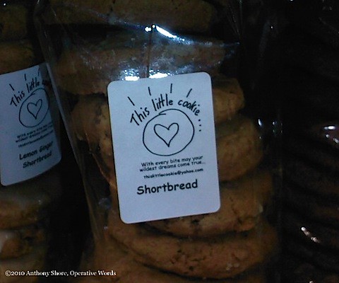
This Little Cookie: Absolutely adorable. This is disarming partly because its design is slightly flawed, as if the cookie maker ran out of space scribbling This Little Cookie but was too busy baking to perfect the label. The name, reminiscent of This Little Piggy, and the letters' uneven spacing give the whole package an authentically human and unmanufactured quality.


batter-c.jpg

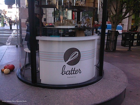
This tidy kiosk is a perfect setting for a brand called Batter. It's a name that's immediate, short, and to the point with nothing artificial added. It suggests their baked goods are as pure and simple.


Food Should Taste Good.-c.jpg

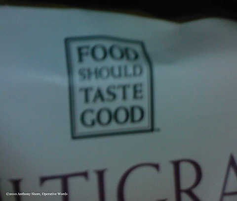
Food Should Taste Good: Not just a simple message, but a four-word name. Because it doesn't follow the established convention of big companies and their short, sharp brand names, Food Should Taste Good feels a little home-made. It's a little unpolished and that's OK. Preferable, actually.
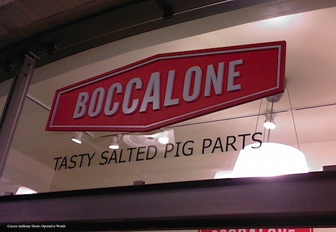

tasty salted pig parts-c.jpg

You know about MECE? Pronounced "mee-see", McKinsey Consulting says that the best solutions are Mutually Exclusive and Collectively Exhaustive. They include everything they need and nothing they don't.

Tasty Salted Pig Parts? 100% MECE.


Ichthyo-c.jpg


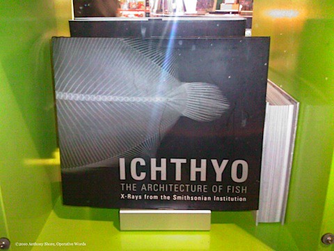
Ichthyo: Breathtaking! So honest and so arresting! A word like that...Ichthyo...that twisted car wreck of a consonant cluster! Why, words like that shouldn't be allowed!

And words like that are not allowed in the sweeping majority of the world's languages. But it just so happens that ichthyo was A-OK in ancient Greek, the mother tongue of much scientific and technical nomenclature, including terms like ichthyo and architecture. (Notice how the book's title and subtitle dovetail perfectly?)

A title as inscrutable and unpronounceable as Ichthyo is an irritant -- an itch -- that lures in the reader to scratch. And yet despite the word's alien, other-worldly quality, it just means "fish".


blackwire-c.jpg

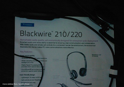
Blackwire is the same as Ichthyo but different. They are both honest yet unexpected. Ichthyo is entirely unfamiliar, whereas Blackwire seems oddly familiar. In a world becoming ever more untethered -- insecure -- a product that actually celebrates its cord stands out. What's good for power cords, spinal cords and umbilical cords is good for headsets, too.

My firm, Operative Words, named and worked on the nomenclature for the Blackwire family of PC headsets by Plantronics. the diversity center-c2.jpg

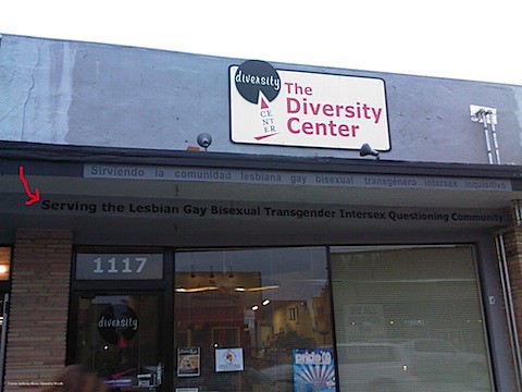
It's clear they mean well enough. The Diversity Center [of Santa Cruz] is obviously committed to inclusivity, as enumerated in their tagline above the entrance. I don't know if Lesbian, Gay, Bisexual, Transgender, Intersex and Questioning Community -- lesbiana, gay, bisexual, transgénero, intersex, inquisitivo en Español -- would qualify as mutually exclusive and collectively exhaustive.

But collectively, it's exhausting.

I wish there was a better and more succinct way for The Diversity Center to describe all of these alternative sexualities. If you've got ideas, throw them in the comments section. If nothing else, your submissions will place Operative Words among some pretty interesting Google search results.


interesting items-c.jpg

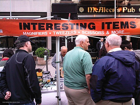
How could anyone resist INTERESTING ITEMS!?

Names like that: Not fair.

passive lawn-c.jpg


What qualifies a particular truth for inclusion in a product's name? Every product has many true qualities and a name can express but one or two.

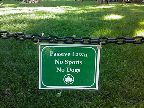
Consider this sign for Passive Lawn in New York City's Washington Square Park. It used to be that a lawn was a lawn was a lawn. Activities officially disallowed were listed on a conspicuous notice: No Ball Playing. No Radios. No Smoking. And so on. Until recently, there was no characterization of the lawn itself.

Urban planners and municipal parks departments evidently need to distinguish different types of public lawns, so those intended for quiet pursuits are branded "passive". (A lawn where activities are allowed would presumably be called an active lawn but a cursory online search uncovered no evidence of its use.)

As I wrote in Describe Different, an innovative product deserves an innovative generic descriptor. The most effective new product descriptors combine familiar terms in unfamiliar ways. The best ones are intuitive and accurate. They are truthful.

Passive Lawn strives for truth but it's not the whole truth nor is it intuitive. The novel use of passive requires a mental leap because it defines a new class of passive -- inactive? -- activities. Inadequate as a stand-alone name, Passive Lawn needs the support of No Sports and No Dogs to convey what's not allowed.

I've considered alternatives to Passive Lawn but they are more flawed. Inactive Lawn might suggest it's entirely off-limits, especially with a chained perimeter like the one above. Quiet Lawn is interesting but also misses the mark.

Perhaps the best solution would be the traditional one: A simple list of prohibited activities. Defining the lawn itself -- something useful for urban planners and parks department workers -- isn't very helpful for park visitors. If this sign simply read No Sports, No Dogs, we'd know all we need to know.

In this case, no name would have been preferable to one whose truth is not self-evident.

gold teeth-c.jpg


Up to now, I've focused on truth in meaning. Names and other commercial words can be functional and obvious and honest, yet also unique.

Although meanings are important, so are appearances. The presentation of a name -- font, size, color, materials, etc. -- can magnify, minimize or morph its meaning.

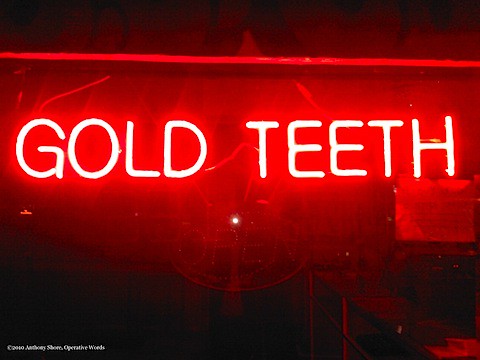
Which brings us to our last exhibit, GOLD TEETH, a spectacular example of meaning and manifestation in true alignment; a visual and verbal syzygy. These words don't merely deliver, they shove. In a compounding reaction, gold and teeth -- each picturable words individually -- combine and project a third mental image that beams so vividly we are compelled imagine it: A gleaming yet incongruous smile flaunting gilded teeth.

This picture in our minds, already palpable and dazzling, is intensified by the words' physical representation: Electric neon, red and shining like polished gold. It is expressive, smiling broadly, exuding the same confidence we might associate with someone who would choose gold for their pearly whites.

It's as if every detail were punctuated with exclamation points: GOLD! TEETH! RED! NEON! CAPITALS!

The honesty of this sign, its stark message and medium, makes it impossible to ignore.


Today's consumers are overwhelmed by marketing excess and underwhelmed by unfulfilled promises. They have become inured to marketing that's rife with the artifice of ambiguity and embellishment. Consumers are disillusioned because much of what they've seen are illusions. Only unabashed honesty will change that.

Like never before, truth is stronger than fiction.

[A version of this post was originally published at Duets Blog, the leading blog on creativity and the law.]

Run Client Run: Stories from a 17-year relationship

There's nothing wrong with a one-time fling. It can be fun and fulfilling -- up to a point.

But in my experience, there's no substitute for the deeply satisfying connection when two people are committed to each other for the long run.

I'm talking, of course, about client relationships.

I've been lucky enough to have a relationship with one particular client for over 17 years. Last week, this client -- who has also become a good friend -- launched another business that I named.

I wanted to honor and thank my client by sharing our stories -- and the 11 brand names we've created. I'll also describe my thinking at the moment I named his latest venture, Run Brain Run.

In 1992, I applied for the position of Creative Services Manager at Aladdin Systems, a small software company that specialized in utilities for the Mac. David Schargel was Aladdin's  president and in charge of marketing  -- as all company presidents should be.

Working for a Macintosh software company would be dreamy. I had been an Apple fanboy ever since my Dad got an Apple II+ when I was 12. Aladdin Systems was known for StuffIt, the Mac's de facto compression standard; working for a standard-bearer like Aladdin would almost be like working for Apple. Kinda. Sorta. OK not really. But still....

After David hired me, he said my effusive cover letter got his attention. As I recall, I gushed "I eat, sleep, dream, and drool Macintosh". It sure ain't "bleed six colors" but seemed to do the trick.

And just this week -- 17 years after he first interviewed me -- David revealed the exchange that actually got me hired:
By far, my most memorable moment during your hiring was when I asked you, "Do you drink so much coffee that you sometimes start to shake?"

You did not hesitate for a split-second and said, "Is that going to be a problem?"
Not my clever cover letter. Not my creative chops. Not my enthusiasm. It was my predilection for caffeine that really won him over. And just maybe, he had a hunch that I was -- thanks to my beverage of choice -- quick on my feet. Jittery, but quick.

David and I shared an itsy-bitsy, teeny-weeny polka dot of an office. During the months we worked in close quarters, I learned a hell of a lot about real-world sales, marketing and customer service. He was a true mentor who also showed me how perfect a boss could be. To this day, I envy his ability to manage people, keep them happy, and help them perform at their best.

The first name I created at Aladdin was SITcomm, easy-to-use telecommunications terminal software that incorporated StuffIt compression.


SITcomm ostensibly stood for Simply Intuitive Telecommunications, but savvy users would spot the StuffIt file extension -- .sit -- built into the moniker. Like the company behind it, the SITcomm name was fun and breezy. Easy for online newbies, but with enough insider-appeal to appease the early-adopter, unduly-influencing, geekier-than-thou critics at BMUG.

As Aladdin Systems' Creative Services Manager, I wore a lot of hats during my three-and-a-half years: copywriter, production artist, designer, ad agency liaison, product marketing lead, product manager, spokesman, product demo guy. I had been there a year or two when David asked me to design a new corporate identity for Aladdin Systems. It would be my first-ever CI project.

The inherent difficulty of designing a logo was made more difficult by the parameters set by the company's senior management team:
  • It had to be an A
  • It had to include a lamp
Alrightythen.

This is the logo I designed for Aladdin:

To all the brilliant Landor designers I've worked with: Go ahead. Laugh away. Get it out of your system. Hopefully someday -- maaaybe -- I can recoup some of your respect.

David has always been an entrepreneur. He left Aladdin (which he co-founded with Jonathan Kahn, another longstanding client who deserves his own future post) and went into the mobile software business. This was back when Palm Pilot was the name in the PDA category and hadn't yet been shot down by Pilot Pen Corporation.

David wanted his new company name to unequivocally suggest "portable". I came up with Aportis. Probably not my best work.


Aportis' flagship app would be a hierarchical to-do manager and idea organizer. It, too, needed a name.

I remember the moment I came up with Brainforest: I was riffing on the word "brain". I liked its sound, brevity, and evocativeness. "Brain" was relevant and productive -- a good working part. I thought of compound words that included the word (like Brainstem), but also compounds that included a rhyme of "brain".

My thought stream in schematic:
brain...rain...rainforest...Brainforest!

Brainforest would serve as more than a name. It became the organizing principle -- the frame -- for the product. Brainforest stores users' content in hierarchical trees composed of branches and leaves. Neat.

David eventually got out of the software biz and sold Brainforest to Ultrasoft. Lo these years later -- at least a decade -- Brainforest is still available for download.

Our next collaboration would be for something completely different: A Portland walking tour company. After a lifetime of working in the digital realm, David was ready to go analog.

He adopted Portland Walking Tours as the DBA. That name's David's creation and to my surprise it's served him well. Standing out is a tall order for a name so descriptive. But it goes to show that there's more to a company's success than just its name. With an affable, business-savvy founder, even names like Portland Walking Tours -- or Microsoft -- can thrive.

David adopted these names I developed for specific Portland Walking Tours:
  • Epicurean Excursion - An upscale tour for foodies
  • Beyond Bizarre - Explore spooky, dark and paranormal locales (mostly for adults but also for families with kids)
  • Wokabout - A tour of Portland's Chinatown
Walking tours of Portland were just part of David's bigger vision: To create a company where "resident experts" could share their love of a place with travelers and citizens. I was asked to help name that company, too.

The new enterprise would include, but not be limited to, Portland Walking Tours. As a holding company it needed a flexible name. David asked for something business-like, since this would be a business-to-business business.

David liked Hometown Advantage when I presented it. Then, upon hearing that I registered HometownAdvantage.com, he positively loved it. As names go, it's a straight shooter. No one's getting fired for hiring a company with that name.


A year later, David approached me with a new challenge: Name an urban "game" company that would be hired for team-building "or just plain fun".

Several name objectives emerged from our early discussions:
  • It should support the key brand idea of "fun with a purpose"
  • It should not include words like "go", "adventure" or "scavenger"
  • It should appeal to corporate team leaders
  • It should appeal to residents
  • It shouldn't sound too athletic
  • It should accommodate many different types of team games and hunts in many different places
I had a blast brainstorming. These themes surfaced organically during the creative process:
  • Hunt/search
  • Games/puzzles/clues
  • Mind/brain/head
  • Groups/teams
  • Out and about
  • Race/quick
When I create names, I go deep then move laterally. Each direction is individually explored as a foundational list of relevant words, word parts and phrases accumulate. After reaching a critical mass of ideas for each theme, I cross-pollinate by combining words from the different categories.

Overlaid on that creative technique, I'll visualize myself using -- and loving -- my client's product. I put myself in an imagined moment where I'm totally absorbed and excited by the sheer awesomeness of what I'm naming. During that time, I believe the make-believe. The feelings, images, and words inspired by my fleeting zeal are fuel for names.

As I thought about David's new game company, I pictured myself in a team on a hunt. We're huddled around a notepad and puzzling through a clue. People are shouting out ideas. I feel the pressure to solve the problem before our opponents. The urgency is palpable, even though it's imagined: "Hurry! Hurry!" "Think faster!"

"Run, brain, run!"

Helllooooo....

I knew Run Brain Run was a keeper. Just three words capture the quintessential customer scenario, a snapshot of reality. Run Brain Run gives people the feeling they are listening in to a heated contest that's always in progress. A moment of visceral excitement is frozen in time, like a blink that never ends.

Run Brain Run has a distinctive yet natural structure. Very few names repeat its beginning at its end, a rhetorical device called epanalepsis. The only two examples I've found are a boy's sportswear label called No Billy No and the 1960's BBC satire, That Was the Week That Was. If you know of other epanaleptic brands, please do share.

David shared my enthusiasm for Run Brain Run. I'm so glad he ran with it.

Hat tip to Jon Supnick who designed the logo with a wit befitting the name:

Two of the games offered by Run Brain Run I also named:

David, congratulations on your new company.

Thank you for being such a great client.

Long may you run.


- Anth